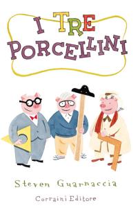
 When it was published in 2000, illustrator and ur-grup Steve Guarnaccia's design snobby retelling of Goldilocks & The Three Iconic Chair-Collecting Bears practically defined the gay uncle gift book genre.
Now he's back with another DWR catalogue x fairy tale mashup, and he's chicer--and more controversial!--than ever. Guarnaccia's The Three Little Pigs, published by Corraini, stars The World's Greatest Architects as the pigs.
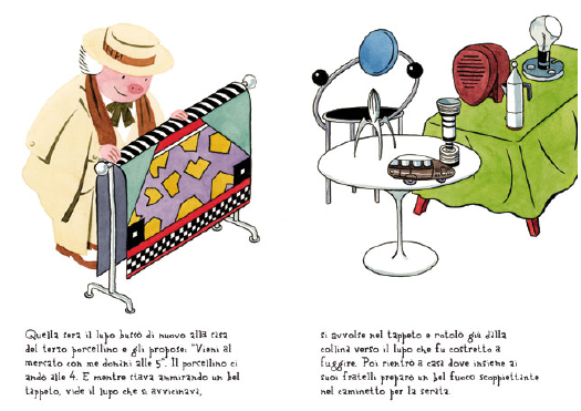
So who's Guarnaccia's wise pig? I'd say "SPOILER ALERT!" but it's right there on Corraini's website: Frank Lloyd Wright. The foolish pigs, meanwhile, are Frank Gehry and Le Corbusier. Architecture critically speaking, this is a bold position to take. Yes, Wright built his houses out of brick, and you could say Gehry built his out of chain link fence [and his chairs out of cardboard], but Gehry builds his museums out of titanium now, so show it, old man! And the urban planners would say that Corbu and Wright were equally oblivious to the ravenous wolf of urban animosity and suburban sprawl who knocked down their towers-in-the-garden.
Judging by the I Spy pastiche of iconic design tchotchkes each picture, I'd guess the author is more unrepentant yuppie collector than connoisseur or critic. Which is fine. Every kid needs to learn Memphis ain't just a city in Tennessee.

But the profusion of stuff also perpetuates the unsustainable, consumption- and product-obsession that's frankly part of the design world's problem right now. And by including two dead architects, Guarnaccia misses the chance to inoculate kids against the media- and commission-hogging starchitect system.
Imagine Daniel Libeskind slapping some crystal-patterned wallpaper on a shed, and then dancing his silly little court jester dance until the big bad architecture critic came along to blow his tenth flyover condo project down. Then the wolf unleashes a barrage of illegal fireworks and burns Rem Koolhaas's crazy, Mobius Strip-shaped house to the ground. And so they run and hide in Renzo Piano's place, where the wolf crawls through the overly complex indirect natural lighting system, and gets roasted alive by the sun, like an ant under a magnifying glass.
As an important educator--Guarnaccia heads the illustration department at Parsons--I expected a litte more from him. Let's see what happens in a few years when he completes the trilogy with Little Red Riding Hood: will he put a fractal Issey Miyake cape on Zaha Hadid and make her Red? Or will he make her the Wolf?
Obviously, buy it in Italian: Steven Guarnaccia, I TRE PORCELLINI [corraini via coolhunting, thanks dt reader rolf]


Gehry holding a t-square is just wrong.
I also would take Renzo FTW. (Overly complex shading systems rule!)
haha, nice catch. it's accurate only in the sense that he doesn't use a computer, just sketches and sculpts for his minions. A crumpled piece of tin foil might have been better.