Just the fleeting impression of a guy who knows a thing or two about inordinately severe crib design and plexi...
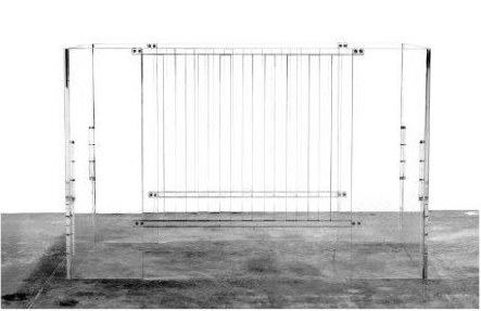
And in completely unrelated news, Nurseryworks previewed their new all-acrylic Hollis crib at the ABC Kids Expo in Las Vegas a couple of weeks ago, and whaddya know, the real life version looks exactly like its promotional photo! Congratulations!
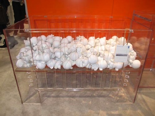
[images via babesta and ohdeedoh, respectively. thanks, sven from kleinraum.de]

As awesome as this looks, I think there's a reason they aren't photographing it with a mattress in it. I have a feeling the look is compromised in a big way once you're looking at the side of a crib sheet all folded and creased between the mattress and the plexi.
I can verify this. If it's true on a crib with one plexi side--and dagnabbit, it is--then it is 360x as true when the mattress and sheet and mattress pad are visible all around.