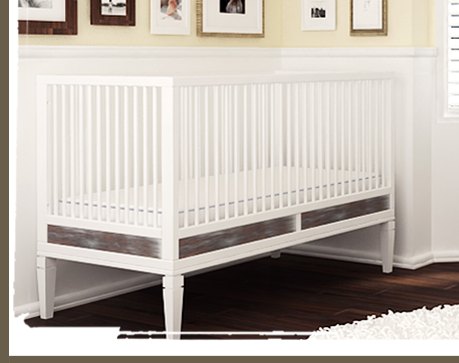
We were out of town, so I missed it, but I haven't seen much interesting kid-related news at all coming out of the ICFF expo in New York last weekend. And one of the bigger launches has barely registered a peep online: ducduc's introduction of MasonGray, a more traditional collection of kid's bedroom furniture.
Since soon after their launch in 2005, it's been clear that ducduc has a much broader vision of itself and its market than just "modern baby furniture for hip parents." They quickly introduced youth furniture and a giant, reality-based dining table with art compartments and walnut & whiteboard leaves. They launched some insane/awesome campaign furniture, and a custom division. And they set up their own sustainable factory in the US.
It's all part of ducduc's [apparent] view that its customers--affluent, engaged, modern families--are characterized more by their interest in materials [hardwood, no MDF, environmentally friendlier finishes] and high-quality, domestic workmanship than in modernist styling.
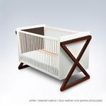
So what does the stuff look like? Understated, but just the slightest bit edgy. ducduc has a fine line to tread to not fall into the retrofantasy worlds of Pottery Barn Kids, Ralph Lauren, Bellini, and whoever the hell else makes all that crusty, traditional, carved grapes & finials stuff, I have no idea. If I had to put my finger on it, I'd say MasonGray's design looks back to the last hurrah of the American furniture industry, the contemporary traditionalism of the 60's and 70's.
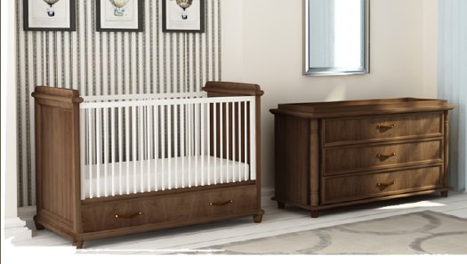
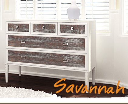
Check out the dark colors of the flat planes of the Georgian line, for example, and tell me it doesn't look a little like a bank you might have visited as a child. The accents on the Savannah line, meanwhile, were made from the old barnwood your father turned over to the cabinetmaker. Or somebody's father, anyway. There's a hint of nostalgia, but it's much more understated than the baroque retro-quotes of the traditional-esque stuff Nurseryworks debuted at ICFF last year.
Which is all a long-winded way to play down the fact that I haven't heard of any detailed specs or prices or availability for MasonGray, and I haven't seen any of the stuff myself yet. Still, it more interesting than it seems to be trying to be. And it finally gives ducduc a chance to use the caps lock key.
MASONGRAY by ducduc [masongrayco.com via ducduc's people]


Looks like they're following Ikea into boring traditional stuff executed poorly.
I keep hoping Ikea's going to have a modern resurgence soon.
You're right; there was nothing of kid-related interestingness at ICFF. Nothing much for adults either.
One of the Masongray pieces on display had a pretty dope, almost flourescent yellow/pink finish on it.
I don't understand the concept of baby/child furniture designed for adults (with very bad taste, might I add). Shouldn't children's furniture be more fun and child friendly?
These pieces look like they were designed for adults inflicted with the 80's nouveau riche flare... http://masongrayco.com/georgian.php
I'd have to have a lobotomy before decorating any room with such boring furniture, let alone a child's bedroom.
well, there's nothing to be done about differences in taste, and I don't know what you mean by "more fun and child friendly."
But for the vast majority of kids' design, "fun" and "child friendly" equal pink/blue, intense primary colors, fantasies [from castles to cars], and licensed characters. EVERY single aspect of which is an adult-created convention so that furniture or the space it's in can be "properly" interpreted as being for kids. Kids aren't born wanting red/blue/yellow/green furniture; they're trained to recognize it as "theirs." Why not make all kid's stuff the same color as the grownups' stuff, so that kids can feel grown up? It's still an adult decision on behalf of kids.
Frankly, if it's made well, it's safe, and it works for pint-sized people, I'd be happier to see more "boring" furniture and less "zany" or "whimsy" or "adorable" or whatever crap is out there right now. Bring it on.
well... I never meant a child's room should look like the easter bunny just took a crap. Duc Duc and many children's furniture companies sure do have some very appealing furniture for kids and adults alike, sans the disney characters.
See this example: http://www.ducducnyc.com/categorydetail.php?categoryid=16&navid=5&infant=1&ducid=a7a43a40bdabfdd637afc91b973d5a5f
Thanks for the lecture... If you didn't warn me I was going to paint my whole house in lilac and fuschia stripes and then adorn the walls with hannah montana paraphernalia.
It's already been brought :P