I hate getting stuff at industry events; it feels very wasteful to me. At a gig like ICFF, most companies are just giving out tote bags anyway, tote bags designed to swallow all the folders and discs and stuff you accumulate--including their competitors' tote bags. It's like a bag war to see whose little handled billboards will stay on the outside for the rest of the fair.
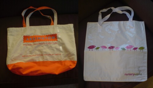
Herman Miller was trying to shock&awe their way to tote bag victory; they sponsored the official ICFF totes, which were being handed out at the top of the escalator, before you even entered the hall. Argington's comfortable hemp bags could make great shopping bags for trips to the Co-op, but the embroidered logo is a little big, clearly optimized for Javitz Center promotional visibility.
Meanwhile, Nurseryworks was determined to win. Though it only held one piece of paper describing their new neo-traditional Lawson-Fenning collection, their bag was huge. It was also stiff and strong, with reinforced seams that helped it keep its portable billboard shape. The kicker was the material; it was made of woven plastic fabric [like Ikea bags, but white], which turned out to be hard to fold. Wouldn't it just be easier, it seemed to say, to put everything else in here?
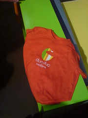
ducduc had bags, too, but I didn't go for one; they gave the kid a t-shirt with the ducduc custom logo on it. Perhaps they figured it'd get remembered and mentioned on a blog somewhere.


The Nurseryworks bags are great - we save them every year and I don't think we've ever worn one out.
embroidered? ugh.
[like a baseball cap. -ed.]
In any case, I think Nurseryworks wins from a graphic design perspective.