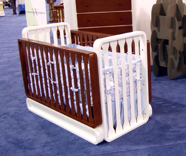
I've been watching Westwood Design's new Pacific nursery collection for a long time now, and so I'm bummed to have missed its debut at this year's ABC Kids Expo. The Pacific is quite a bold design move for Westwood, which is a very traditional, mainstream nursery furniture company, just the kind of company I would have expected to never embrace modernist and contemporary design. And yet here we are.
Pacific's designer, Scott Bennett, is a longtime DT reader and contributor, and I hope I don't get him in trouble by saying he shared renderings of the sweet, curvy Pacific crib over a year ago.
Seeing pictures of the real thing--and hearing how well it was received in Las Vegas, with lots of interest from retailers across the country, not just on the coasts--gives me hope to think that clean, contemporary design may yet find a place in the mainstream culture of this country.
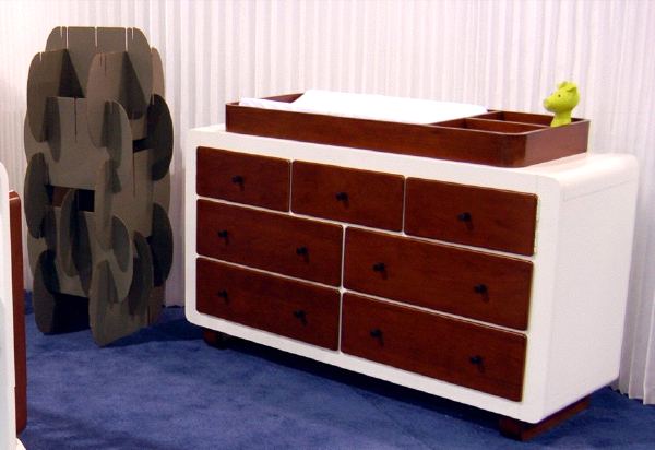
The Pacific--the collection includes a matching dresser and a dresser/changing table--is priced to move, too: the crib's in the $5-600 range, I expect, that sweet spot in the middle of the market where clean design has been so lacking. Multiple configurations--holy smokes, there are 10!--extend the life of the bed well beyond the crib stage, too. Ten, really? Wow.
High five, Scott [now about those crib bumpers...]
Westwood Design: Pacific [westwoodbaby.com]



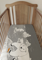
Now about that sweet slot-together house of big gray cards in the background... (!)
I believe that slot-together structure behind the crib is the Nomad system. Here's a link:
[yep, thanks, I was trying to remember the name. -ed.]
very attractive crib design, though i can't say i'd love it for my future nursery, peronally. the other peices though - the dresser and changer, especially - are gorgeous.
The dresser/changer, yes. The crib? Yeow. That's one ugly piece of kit.
That is just hideous! The shape looks like it belongs in a space station in a sci fi movie, while the wood/white mix makes me think they forgot to paint the sides.
[or it's a reference to the granddaddy of high end modern cribs by David Netto, which has been picked up by ducduc, Argington, Nurseryworks, Offi, Manhattan Crib, who am I forgetting? You can hate on it, but it's an established style that's been absent AFAIK from the traditional single-finish crib sector. as for the shape, a sleigh-shaped crib is hideous to me, and space station doesn't sound all that bad, so different strokes. -ed.]
I have to say, I started hearing "Also sprach Zarathustra" when I saw that crib. BUM bum BUM bum, BA DA!!! A shiny white floor and a big black monolith in the center of the room would be perfect accessories. But the bedding kills the aesthetic.
It would be totally awesome if those white bottom pieces rolled the crib around like a track excavator. The look doesn't appeal to me personally but I could overlook it for that.
I'll swap my Stokke crib for this + $200. I'd take it apart, paint the white part black and the wood part red, Murano glass chandelier, black and white paisley wall paper, and done. Cocktails in the nursery!
[whoa, extreme nursery makeover. I smell a DT contest... -ed.]