Maynard Parker was a prolific architecture and design photographer based in Los Angeles who shot for House Beautiful, Sunset Magazine, Architectural Digest, for decades. Though he died way back in 1976, his massive archive was donated to the Huntington Library in 1996. About 10% of it--6,000 images--is digitized and searchable online.
Maybe we just pay much greater attention or have much higher expectations for kids' design today, or maybe our photostylist technology has just evolved exponentially. But I gotta admit, most of the nurseries and such in the 50+ photos that turned up looked kind of boring. Here are a few details that stood out. [Definitely click through for the full images.]
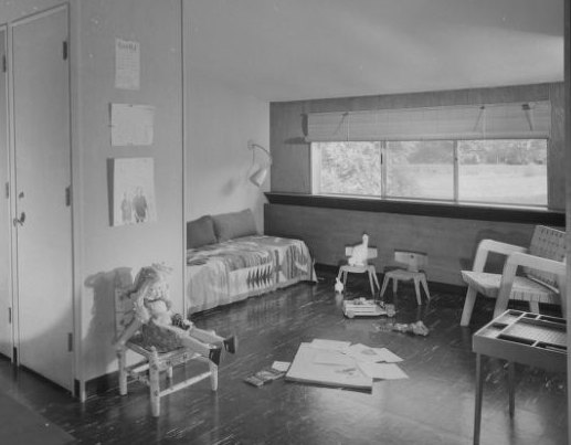
Alexander Girard Residence, Grosse Pointe, MI, 1951: linoleum was hot. Eames kids chairs, no surprise.
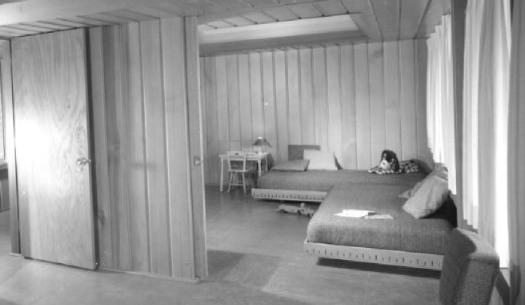
Calvin Bain residence. Prairie Grove, AR, 1959: There were a couple even more austere than this, but the platform bed and the sliding wall looked kind of cool. It seems it's not mentioned in the Huntington's database, but Bain's house was the first published design by Fay Jones.
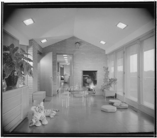
Harold Price Jr. residence, Bartlesville, OK Architecture students' ears will perk up at the mention of Price + Bartlesville. It's the site of the HC Price Tower [1956], Frank Lloyd Wright's only built skyscraper. The kids room is possibly the least interesting room in Price's Wright-designed house. [Also, it looks like the kids have grown up and moved out; it's just a random living room now.]
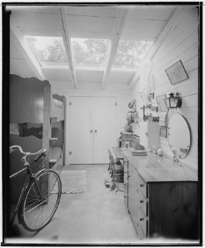
Robert & Virginia Stanton residence, Carmel CA, undated: The Stantons knew the path to brand immortality lies through foundations donating to PBS or NPR or something. Stanton was a builder who experimented with modular housing, but I think it's the idea of sticking your kids in a whitewashed barn with a couple of awesome skylights that appealed to me. That dresser is actually a wash basin. And zoom in on the huge science set on the desk.
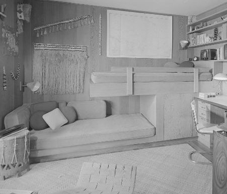
Liljestrand residence, Honolulu, HI, 1958: The lack of context and metadata in the Huntington's database is starting to bug [1]. The Liljestrand House by Vladimir Ossipoff is a spectacular modernist masterpiece; House Beautiful chose it as the Pace Setter House for 1958 and ran a 53-page [!] feature on it. That cantilevered bunkbed/sofa thing is pretty damn sweet, though you just know the kid'll be jumping off of there every chance he gets. There's a similar setup in another room.
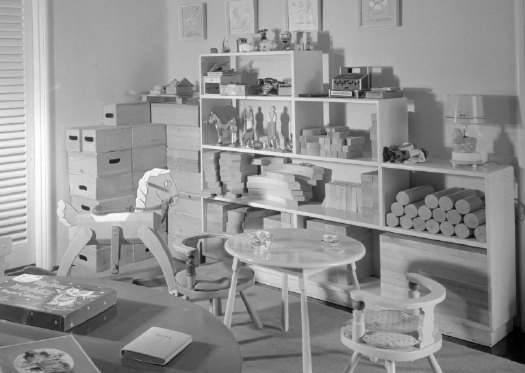
Cliff May residence #3, Los Angeles 1944-45: Sure, Clifford May was the father of the Calfornia ranch house, which defined the postwar American lifestyle of the 20th century. But he was also the father of some damn lucky kids, who got a full set of Creative Playthings maple building blocks--and then some. Just check out the "children's patio."
Search for Maynard + Parker on U Cal's library database [universityofcalifornia.edu via latimes via mefi via things magazine]
The Maynard Parker Collection [huntington.org]
[1] OK, it's the Calisphere database for the Univ. of California system which has the that metadata problem. The Huntington database is actually built from the other end of the telescope. Everything is sorted by "projects" and location, etc. The Liljestrand house listing has seven photos--but not the ones from Calisphere. Also, results are completely unlinkable. And "any" requests for publishing are to be made only in writing. Mhmm.

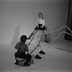
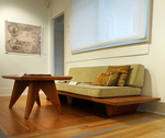
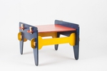
This one looks a lot like our daughter's room, actually. I actually like kids rooms that aren't over decorated. But hey, we're boring and a bit weird.
I meant that first photo, by the way.
Thanks for sharing all these photos. Really interesting how these look in black and white. It created a more sophisticated effect. By the way, these best gifts that you could give your better-half might interest you too. Thanks and have a nice and fulfilling day.
Some kids rooms--like Mary Pickford's and the Fondas--looked really well-decorated and traditional; the Fondas had some early American/Shaker thing going that could be really great. But I've been thinking about this since writing "boring" last night. I think there's an ever-widening gap between the reality of a space and the image of it. It really is the damn photostylists.
There are lots of photos where Parker [or someone, but I assume it was him] artfully distributed boardgames across a tabletop [see the full shot of Cliff May's kids' room] to fill in the foreground table. Today, a stylist would have rearranged the entire room and put the table in the garage.
Here's a very composed Parker image, a "still life with those California pottery mugs and Oreos." But the room itself is just a chair and shelves and a TV.
I love it when you showcase these old style kids rooms. Thanks as always.
And oh my you weren't kidding about the awesome chemistry set. Where can I get one of those?
I'm sure they're considered a WMD by now.