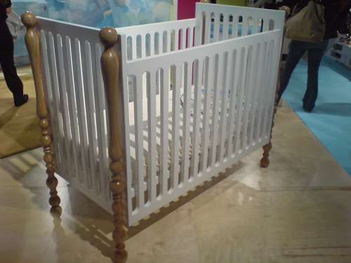
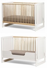
So I've been thinking about the Lawson-Fenning collection Nurseryworks introduced this week at ICFF, which combines some modernist design elements with very traditional furniture references--things like turned bedposts, thickly padded headboards, and wingback rockers.
It definitely caught me by surprise when I saw it, and I see that I'm not the only person scratching his head. [Well maybe I'm the only one scratching his head; the commenters on Jenn's Lawson-Fenning post at Minor Details so far are all women.]
Here's what I've been thinking: by partnering with Lawson-Fenning, a high-profile, design and decorating firm whose focus is on "high-end" more than just "high modern," Nurseryworks is trying to break out of the modernist nursery niche they helped found. [update: whoa, full stop. I'm looking at Nurseryworks' site now, and ALL their signature designs are credited to Lawson-Fenning. Every piece of furniture not by Truck. So yeah. What a difference above-the-line credit makes, I guess.]
It's no secret that the modern nursery market has gotten crowded in the last couple of years. I've got nothing at all against Litto Studio, Ecotots, Roberto Gil, and a handful of other clean, modern-style nursery furniture startups, but I also can't pretend to be all excited about the introduction of yet another $1,300 Netto-lookin', clean, white lacquer crib and changing table set.
When the US modernist nursery movement began five years ago, the major baby furniture manufacturers were totally absent [and for the most part, they still are.] There was Ikea or David Netto, and maybe Stokke, and a couple of woodworkers, and that was it. Then Oeuf and Nurseryworks came along, then Argington and ducduc.
Nurseryworks always made an attempt to differentiate their designs with decorative options like their shaped panels and slats, and all their fabric options and whatnot. But by now the modernist niche is full, and what passes for modernist design and innovation is an amazingly narrow near-cliche.
And you know what, the modern style lover market is not as huge as modernists like to think it is, and it's certainly not the only segment where people are willing to drop more than $1000 on a crib. In fact, I'd guess that with the Lawson-Fenning collaboration, Nurseryworks is reaching out to a far larger segment of the deep-pocket market than the designhound ghetto they've been focused on for the last four-plus years.
[How small is small? Remember when those David Netto cribs were recalled last year for a manufacturing defect? The number of cribs affected hinted that in 2004, the company was making around 200 cribs/month. Ikea can make 200 cribs an hour using the sawdust from just one Vietnamese assembly line.]
So if the design*sponge squarepants crowd is bummed because Nurseryworks didn't launch a hand-drawn owl collection this year, and if the unrepentantly cheap modernists are pissed because there's no $300 crib made from reclaimed high school gym bleachers, either, at least we can all rest easy knowing that Nurseryworks will survive the inevitable modern market downturn/shakeout. And more importantly, there'll be at least one less PoshTots Princess Fantasy Nursery in the McMansions of West LA.


"design sponge square pants"? Are you admitting you are a fan of the original sponge square pants?
You crack me up.
We are looking to make the transition to the kid bed? I will look forward to your suggestions. See you soon.
Not having seen these in person, I hesitate to comment. But my initial reaction from your photos was that rather than breaking out of a niche (modernist kids furniture) and going more traditional/mainstream, they were breaking into another. Given the "antler trend" in recent high end design, they seem to be following the lead of other expensive designers whose work seems neither modernist nor traditional, but takes an eye-winking, ironic look at traditionalism. http://www.millerstudio.us/
In other words, the Nurseryworks LF line is not unlike an earlier era of postmodern appropriation a la Michael Graves except the reference points are more turned colonial spindles than classical antiquity and neoclassicism. I tend to agree with Douglas Crimp's criticism of Graves-style transhistoricist appropriation in contrast to the much more interesting lateral appropriation of someone like Gehry, whose early designs introduced industrial materials like chain-link in an interesting, novel way to domestic architecture. In that regard, Gehry-style appropriation seemed to be more progressive and forward-thinking (and pushed design in important new directions) unlike the unthinking neo-traditionalism of Graves. (note - I'm talking about late 20th century Gehry, not the ubiquitous and somewhat tired designs of recent Gehry work)
That said, I'm on the fence regarding the Nurseryworks LF stuff. On the one hand it looks sort of Graves-like in its kitschy, unthinking appropriation of iconic staples of children's furniture (turned spindles!); on the other hand, the mix of those spindles with CNC routed MDF walls a la Oeuf puts the past into an interesting conversation with the present. In that regard I find it kind of playful and fun, which is perfect for a kid's room. Either way, I have a hard time seeing the market for this kind of children's room furniture being any larger than that for modernist kid's furniture. What *is* exciting is that it is different than kid's furniture design from 20 years ago, reflecting a potentially more nuanced view of what a kid's room can look like.
[uh, exactly what I was thinking. actually, I think the Graves reference is very apt, for better or worse. There is a kind of post-modernist pastiche element to the crib, at least. The other pieces are less hybridized, and more straight-up traditional furniture. Looking at L-F's other work, I get the sense that there's more comfort/luxury/indulgence behind them than concept. It's the kind of expensive, tasteful design you can slip "a few good (20th century) pieces" in with, no problem. I don't really like Nurseryworks' line--though the crib is growing on me--but I have to give them credit and thanks for shaking up the orthodoxy of the modern kids room. -ed.]
A "hand drawn owl collection"?!?! Haha, that is very Grace Bonney! Anyway, agree that the modernist market is a lot smaller than we like to think, in general. I just think that this crib looks like they're trying to come up with ways of recycling some extra parts they had laying around. Can't see any charm or coherence in it, even in an ironic way.
[though I think the irony/self-awareness point is a good one. i don't think it's antlers-level irony, but those are some pretty elaborately turned bedposts. -ed.]
"antler trend"
That's exactly what I thought, though I must say it's a pretty bad attempt. It looks they got some unfinished pine posts, stained 'em, and put 'em on last year's crib. How about a mauve lacquer, no grain showing? Or lucite? I like the nod to the traditional cropping up all over the place, but it seems like really delicate territory.
I think your analysis is spot-on. The Dwell-reading (Dwell-dwelling?) market is saturated and there are much larger high-end markets to be tapped.
That said, Nurseryworks is pointed in the wrong direction with this. It's a jack-of-no-trades design doing everything poorly. At best, it is a forced eclecticism, an aren't-we-zany-by-merging-styles-which-clash design aesthetic that makes me think of Punky Brewster's "wacky" outfits.
The comparison to Graves is apt, being a design which will clearly not stand the test of time.
Just gotta say, that is the ugliest crib I've ever seen.
[uhhh... -ed. ]
My experience with Nurseryworks and their products has been horrible. I only wish that I had known this before I spent $1500 on a crib by them. Our crib broke after only 2 months of use, and I have had to fight with them for 4 months to get a replacement. It has taken this long because they refuse to return calls or emails, and my husband and I were so concerned with the safety of the crib, that we ended up buying a new one.
I have told everyone I know not to buy Nurseryworks products, and I have even alerted the stores that carry their products about the issues that we have had. Considering that we are the first of our friends to have kids, I hope that our friends take our advice and STAY AWAY FROM NURSERYWORKS!