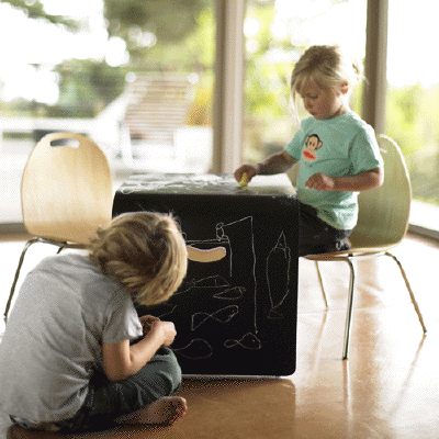
Modernseed actually "leaked" their great-looking Chalker, a curvy, molded wood play table with a chalkboard surface, a few months back when they ran it in an ad in Dwell. Turned out that production wasn't quite ready yet, though, and unlike online advertising [>> like >> right >> over >> there] the archaic print industry's long lead times and poor results tracking couldn't keep up.
So when I finally saw the Chalker and the new, molded ply Chip chair at MoMA Design Store--they may be sold separately, but they go together like aloe wipes and baby butts--I had to give a shoutout. They're solid, elegant, and beautiful, with just a hint of mid-century design elements to make them feel like instant classics. [With its silhouette and chrome legs, the Chip seems so resolved and obvious (now), it feels like something the Eameses could've designed, but somehow totally missed.]
The Chalker Table is $125, and Chip Chairs are $140/pair at Modernseed [modernseed.com]

The chairs are awesome... the table looks cool too, although the novelty of something with a chalkboard surface wears off when you think of chalk dust all over your house. (Besides, you can get a spray on can of chalkboard paint for less than $10 at most paint resellers... you could do a half wall for the kid or something if you're so inclined.)
[I'm actually working on just such a DIY chalkboard paint experiment right now; stay tuned for the results -ed]
Make sure you use the magnetic chalkboard paint.
We painted the door to our garage with chalkboard paint. It is awesome. The kids can doodle on the bottom half, and we use the top half to keep track of todo and mini-grocery lists.
But forget the chair and tables. I want a room with windows like in the picture.
I'm not feeling the chairs; there's too many Arne Jacobsen "inspired" knock-offs out there.
Am I the only one who's a little tired of products "the Eames could have designed"? How many uninspired, pseudo mid-century kids chairs and bassinets do we have to bear before someone takes a shot at being avant garde?
[different strokes, stef, but what is 'avant-garde'? There are Bauhaus designs that look starker and more out there than anything being designed today. Maartje Steenkamp's furniture rocks my contemporary world, but even that looks a bit de Stijl at times. I agree that mid-century can be as annoyingly fascistic, tasteful and conformist as anything else. Around here anyway, "Eames could've designed it" is meant as a positive reference, not as a be-all, end-all, case closed edict. As a design vocabulary that people can grasp, that makes them generally comfortable, and that plays relatively well with a variety of other styles, it does pretty well. Pfeiffer's chair is reminiscent of an Eames or a Jacobsen, sure, but the table is coming from somewhere completely different. And then his molded wood Bro-Sis chair is different all over again. If you have any good examples of 'avant-garde' to contribute to the discussion, though, please do. -ed.]
Sutnar was doing it in the 1920s. Ko Verzuu was doing it in the 1930s. Gerrit Rietveld made some sweet changing tables and chairs [here's some high chairs -ed.]. Anthony Bros. did (and still) makes a sweet tricycle. Peter Keller made a dope bassinet at the bauhaus in 1922. Gloria Caranica designed The Rocking Beauty. The Eameses did design an amazing molded-plywood child's chair and table (and elephant). You could say that it's all already been done.
I think the avant-garde thinking is there though; and, of course, they're Dutch. Piet Hein Eek has been making amazing children's chairs and bassinets for years. Although he seems to fly under the radar of most American kids-modern enthusiasts, he was an early member of Droog. Ineke Hans takes another look at kids furniture and toys in her Black Beauty series. Although an interesting concept, I'm disappointed in the quality of her "Black Beauty" pieces. They're extremely heavy (awesome) but poorly constructed in the spirit of IKEA flat-pack (not awesome), especially because they ship from the Netherlands fully assembled.