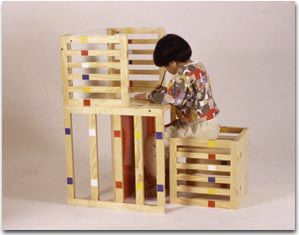

Some of the earliest exhibited work of Hiroki Takada, a designer based outside Nagoya, is kid's furniture. Dubbed System 1, 2, and 3, Takada created clean, simple wood furniture based on square shapes. Yes, it looks like slats or crates, which I think was part of the point.

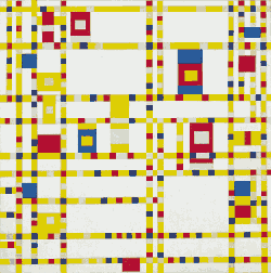
The thin horizontal stripes of color across the vertical stripes give a kind of Broadway Boogie Woogie-style visual energy. It's not clear how many of the designs have been produced, or where they are, etc. [So if you're producing and distributing, he's licensing. Of course, unless you're a religious community, making modernist kid's furniture that's not prohibitively expensive to produce puts you square in the competitive path of the Swedish Monster in the Big Blue Box. It's worth noting that Ikea hadn't reached Japan in 1995-2000, much less the outskirts of Nagoya.]
But even if they're not available at the mall, they can provide inspiration to the modernist woodworking DIY dad out there.

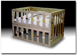
One of my favorites is the Japanese-form crib which, with those wide gaps between the slats, would get sued out of the US in about five minutes.
Hiroki Takada Kids Furniture Systems, 1995-2000 [takadadesign.com via mocoloco]
There is some interesting stuff there.
The crib even... But yah I don't wanta walk in and see my kid hanging from his head through those slats.
Speaking of which. Are there many "modernist woodworking DIY dad"s in here?
Any want to share links of work they have done?
posted by: officeboy at October 24, 2006 6:15 PM